I redesigned this local studio's cluttered website that lacked clear hierarchy and well defined user actions into a streamlined experience aligned to business needs. I focused on accessibility enhancements, clear CTAs, and a modern aesthetic while maintaining brand consistency and warmth.
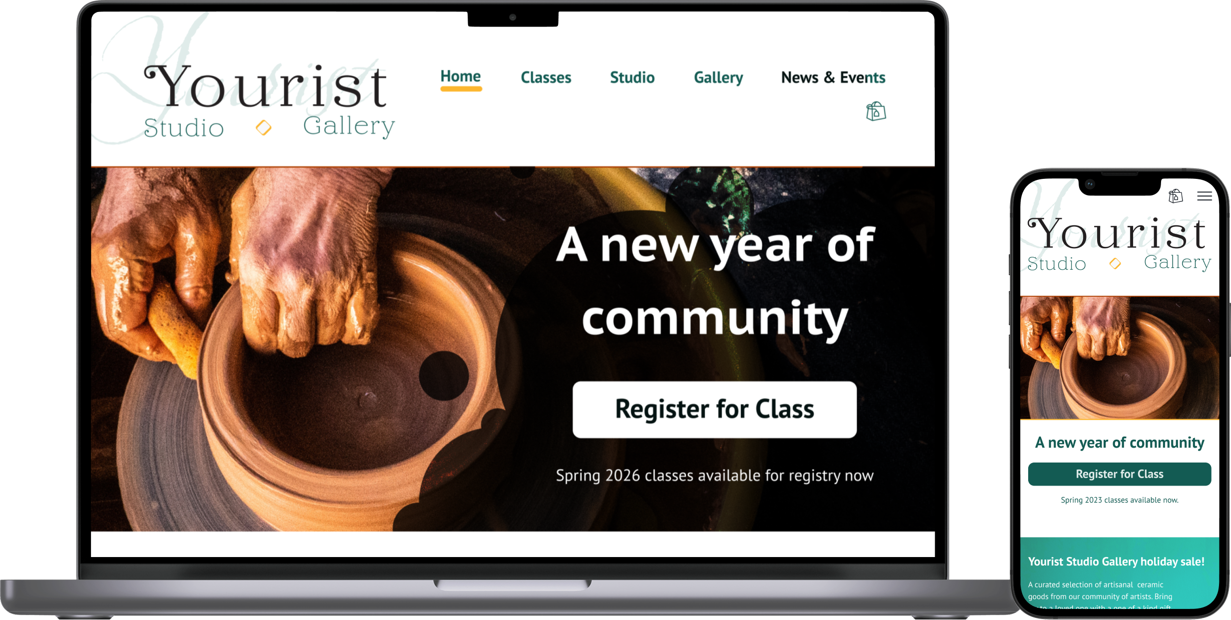
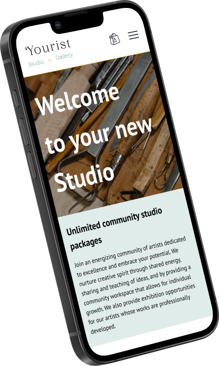
Ceramics is both a visual and tactile art, and I wanted the site to capture that sense of “hands-on” warmth. The desktop layout uses one or two-column compositions that fill the full width of the page, paired with bold humanist typography to create a clear, welcoming entry point for visitors.
The layout collapses into a single column with full-width CTAs that keep actions prominent and touch targets accessible. Each “screen” of content is designed with hint-and-reveal pacing to encourage scrolling and maintain focus on one task at a time.
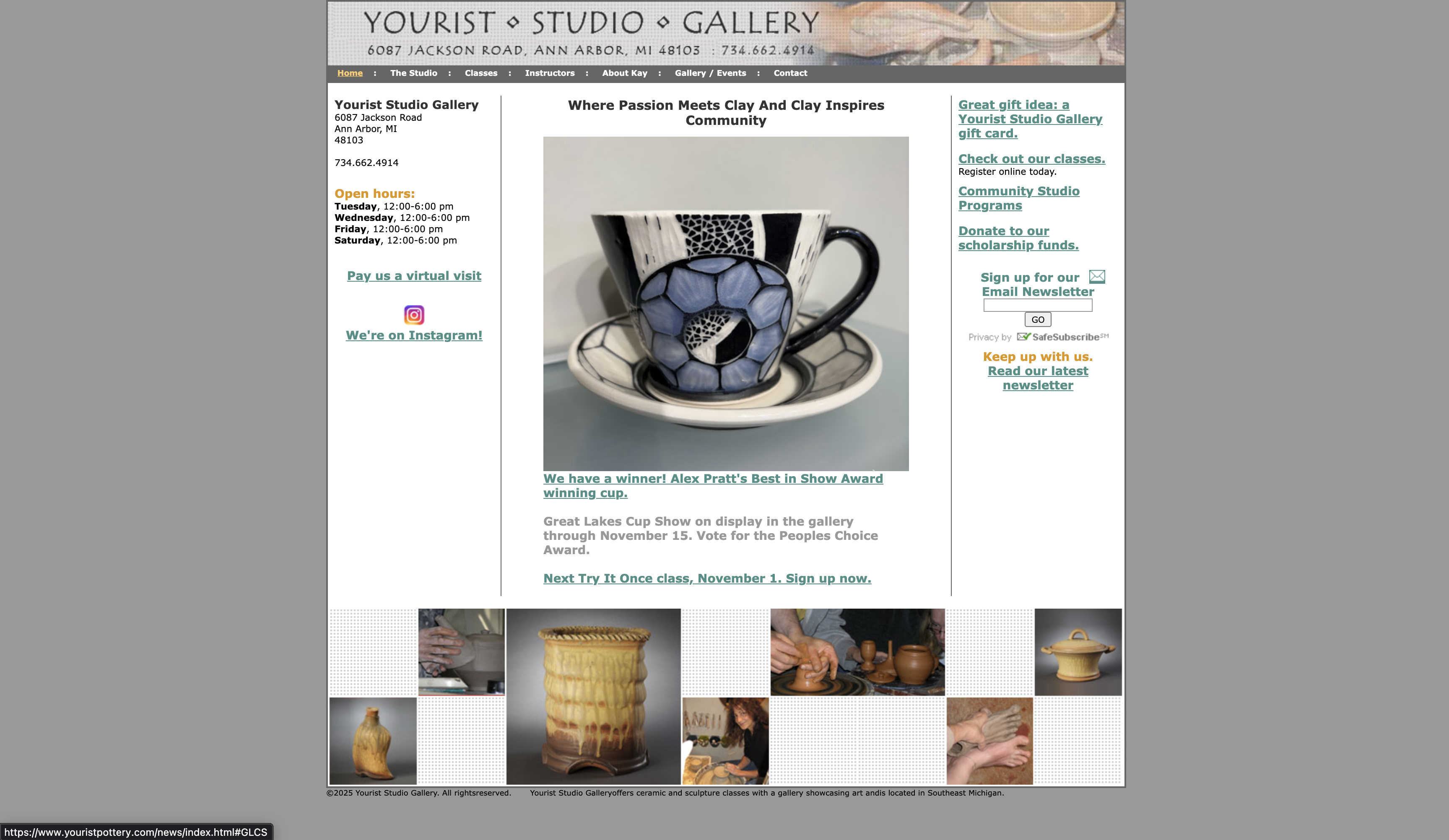
The original site relied on a dated, table-based layout with dense content blocks and little visual hierarchy. The lack of mobile responsiveness made key information difficult to access on smaller screens, and the large gray margins diminished the warmth and tactile energy associated with the studio’s brand.
Navigation and primary actions were obscured by competing text and redundant elements, forcing users to scan heavily to complete basic tasks. Class listings, testimonials, and operational details were presented with equal visual weight, making it difficult for visitors to understand what to do first or why to stay engaged.
These issues presented an opportunity to reimagine the site as a more accessible, visually inviting, and task-driven experience that better reflected the studio’s creative identity.
"How might I modernize the site to attract new customers without losing the trust of long-time members?"
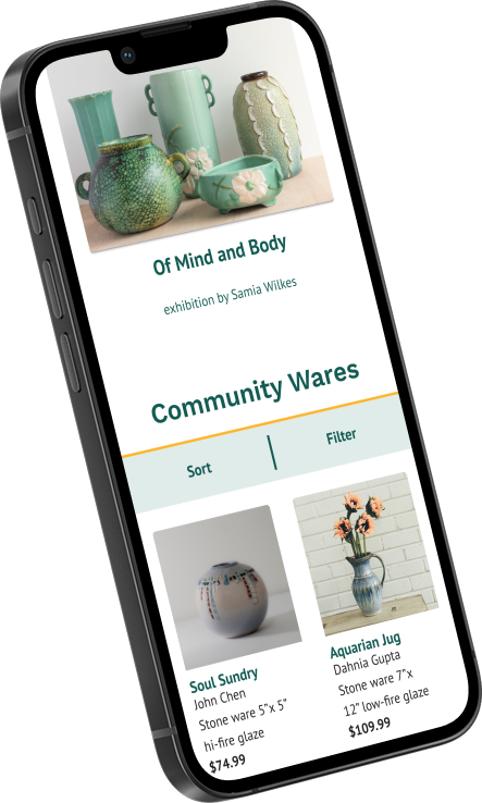
I began by identifying the core business-supporting actions: class registrations, studio memberships, and gallery purchases. Each now has a dedicated page within the site’s architecture, with direct access from the homepage to reduce friction and encourage exploration.
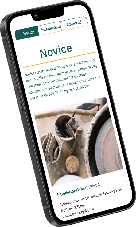
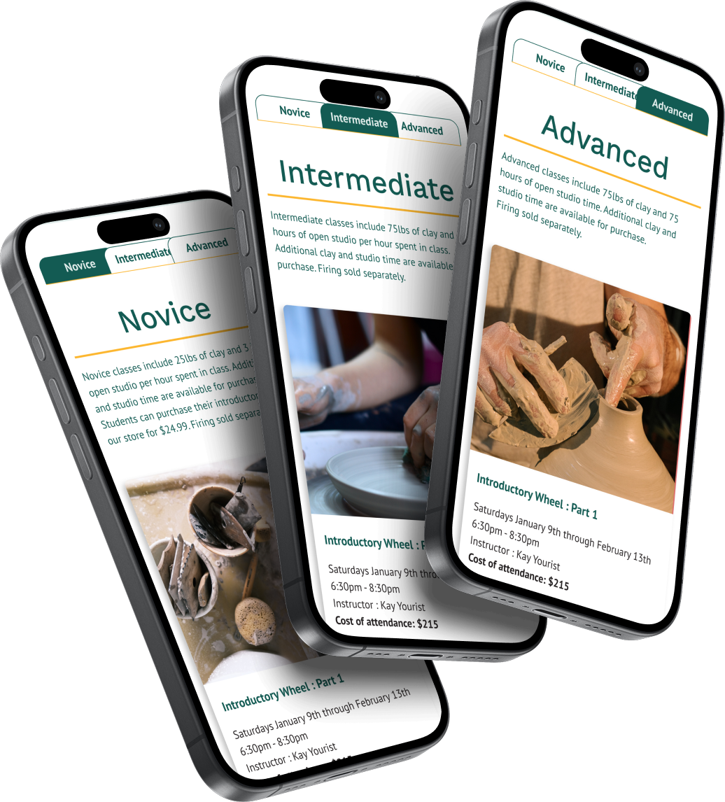
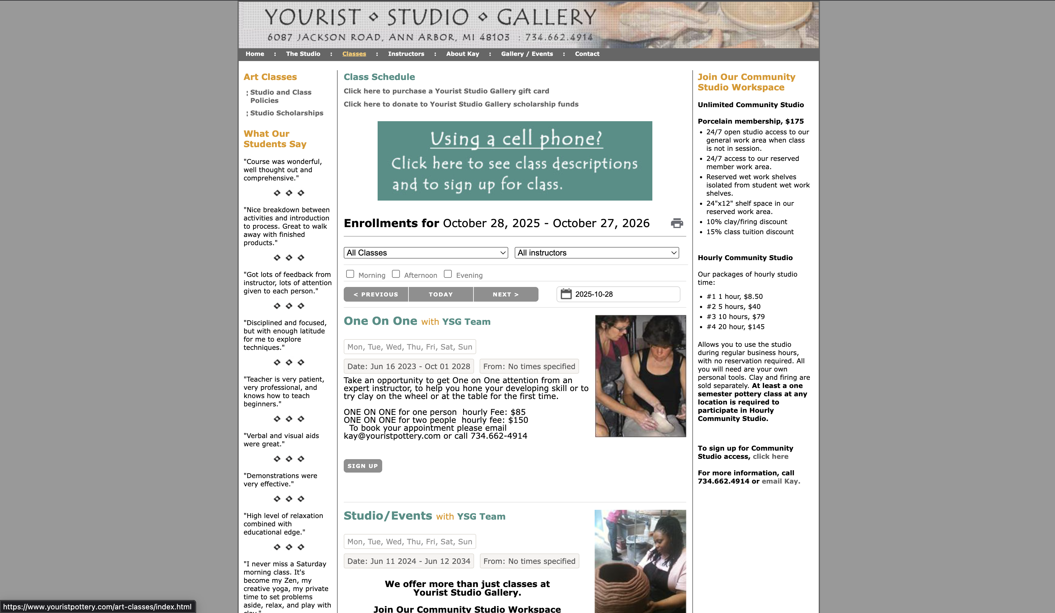
User interviews revealed that participants were overwhelmed by the original class listings. Too much information appeared at once, and difficulty levels were unclear.
The redesigned class selection system introduces a clear, tiered structure that aligns with familiar difficulty scales. This not only helps users find the right fit faster but also positions the studio for a more transparent and scalable business model.
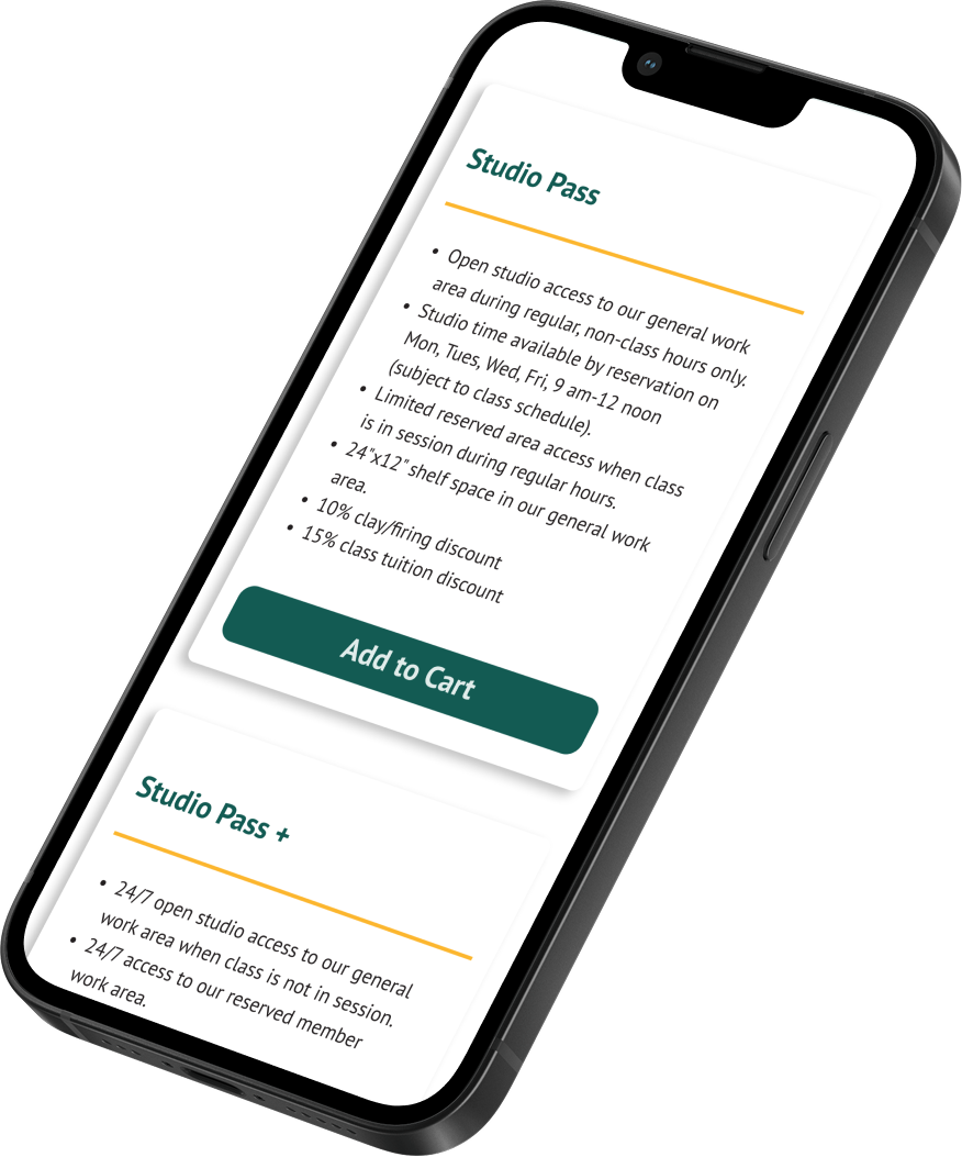
The studio originally offered two membership tiers: Stoneware and Porcelain. While the porcelain tier cost slightly more and included additional perks, user testing revealed that most participants misunderstood the naming. Several assumed the titles reflected restrictions on materials they couls use rather than levels of access.
To resolve this, the memberships were renamed Studio Pass and Studio Pass+. The result is a more intuitive system that aligns with user expectations. Though the new terms sacrifie material charm, they significantly improve clarity, reduce hesitation, and support faster decision-making and conversion.
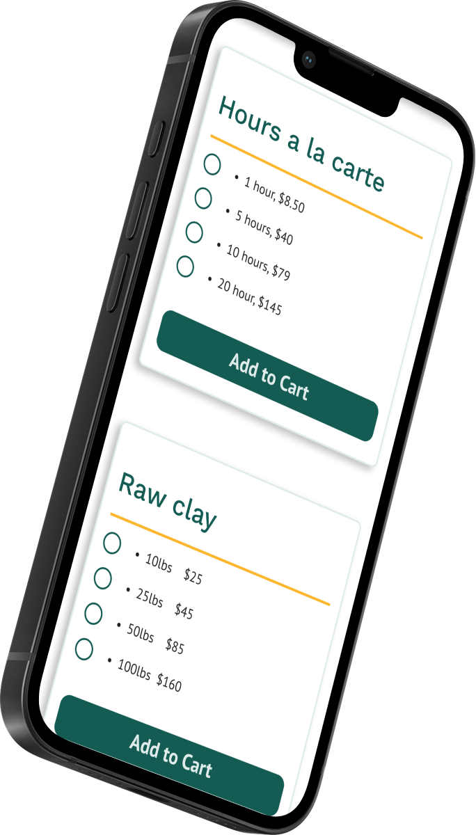
The studio also sells studio hours and additional clay as à la carte items, but the original site offered no quick way to purchase them.
The redesign introduces a dedicated section on the studio page with simple radio-button selection and one-click add-to-cart functionality, allowing users to buy add-ons quickly and without friction.
The redesign brings the studio’s digital presence in line with both user expectations and business goals. Simplified navigation, clearer calls to action, and improved task flows give users greater confidence and control, while reducing the workload on staff by aligning the site’s structure with real studio operations.
I'd love to chat about how I can support your UX needs